Accessible hover actions
It’s a common pattern to expose actions when an element is hovered — like showing edit/delete buttons on a card. You’ve probably done this before: hide the buttons by default, then reveal them on hover.
Something like this:
.actions {
  opacity: 0;
  position: absolute;
  transition: opacity 0.2s ease;
}

.card:hover .actions {
  opacity: 1;
}
This works fine for mouse users: hover over the card, and the actions show up. But let’s dig a little deeper.
If you try tabbing through this interface, the actions are still there in the DOM, but they’re invisible. You can focus on them, but there’s no visual feedback — which makes the experience unusable for keyboard users.
First improvement: :focus-within
We can improve this by showing the actions not just on hover, but when any child of the card is focused. For this we can use the :focus-within pseudo-class.
.card:hover .actions,
.card:focus-within .actions {
  opacity: 1;
}
Now keyboard users can see the focused action. That’s better — but there’s a new problem.
But we have another issue — if a mouse user clicks one of the actions, the action would stay in a focused state even after they removed their mouse cursor from the card. The user would have to click elsewhere for them to disappear.
That might sound minor, but it creates friction and unpolished experience. Users don’t expect the actions to “stick” like that.
Second improvement: :has() + :focus-visible
Sadly, there’s no :focus-visible-within in CSS (yet).
But we can simulate the behavior we want using the :has() selector. The :has() selector in CSS is a parent selector — it allows to apply styles to an element based on its children or descendants.
.card:hover .actions,
.actions:has(:focus-visible) {
  opacity: 1;
}
This way, we only show the actions if:
- The card is hovered (mouse)
- OR one of the actions is focused when it was reached via keyboard
Mouse users don’t get lingering focus styles, and keyboard users get the visibility they need. Best of both worlds ✨
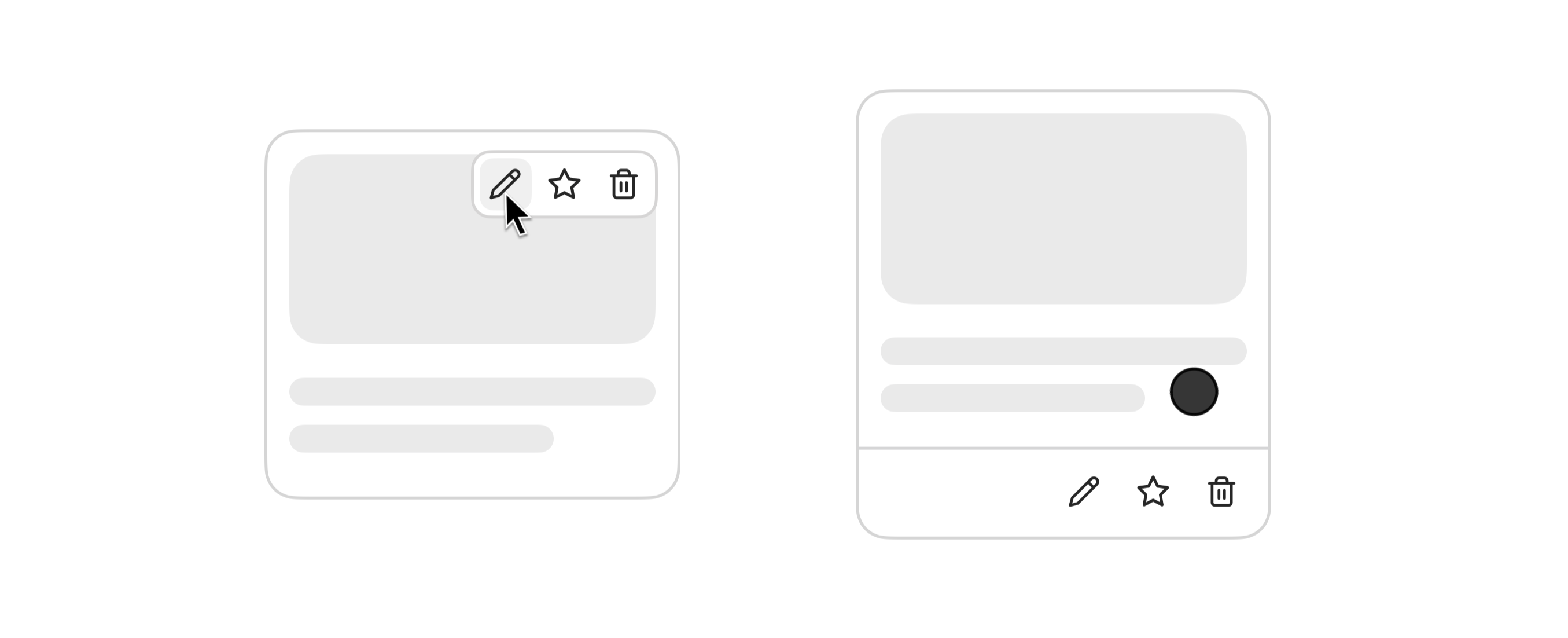
What about mobile?
Touch devices don’t support hover, so none of this works on mobile right now (or any other device without hover support).
We can use a CSS media query @media (hover: hover) to scope our hover logic. What is left is and provide a fallback for devices without hover support:
@media (hover: hover) {
  .actions {
    opacity: 0;
  }

  .card:hover .actions,
  .actions:has(:focus-visible) {
    opacity: 1;
  }
}

/* fallback for devices without hover support */
.actions {
  border: 1px solid var(--border);
}
Now on devices without hover support (like phones), the actions won’t rely on hover at all — we can render them visibly inside the card.
TL;DR
This small pattern shows up everywhere. But making it accessible and usable across mouse, keyboard, and touch takes a little extra care.
With just a few modern CSS features:
:has():focus-visible@media (hover)
We can build something that works well for everyone — and adds a level of polish that really elevates the experience.